There is much to be said for just putting one foot in front of the other every day" — Warren Buffett
When looking at a problem it’s always tempting to go for the big solution rather than looking for a series of little improvements.
I can understand the attraction.
Big feels like it will make an impact.
Big gets people’s attention.
Big is easy to sell.
Big hogs the headlines.
But, let’s not forget the advantages of little:
Little is easy. Just one small step.
Little learns from experience. Each change builds on the lessons of the last.
Little can happen today, without lots of planning and organising (whereas big always seems to be something you’ll do sometime in the future).
Little is low risk, because it lets you be wrong some of the time.
Little is mostly under the radar.
Here is an excellent example of this, which I heard about at the Pecha Kucha (pronounced: pe-cha-cha, if the organiser from Auckland is any guide) night held in Lower Hutt a couple of weeks ago.
One of the speakers that night was Kris Sowersby. He is a typeface designer. He designed the All Blacks font (and many others).

One of the examples he showed was a font he designed for a pitch to Telecom Directories (back in the day before this part of the business was sold).
He came up with a bunch of simple design changes to improve readability and make the millions of bulky directories they print each year more efficient to produce (i.e. less paper, less ink, etc).
Part of this was a new font, called Aperture, designed especially for this purpose.
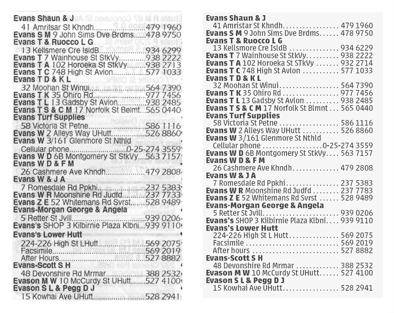
Here it is compared side-by-side with the current font (click to see full size):

It was designed specifically to be legible at smaller sizes, unlike most fonts which are optimised at around 10-14px.
It was designed to be easy on the eye. It was based on the “Humanist” style, i.e. open, easily distinguishable letterforms, unlike the current fonts used which are based on the “Grotesque” style, i.e. closed, rigid, indistinguishable and mechanical letterforms.
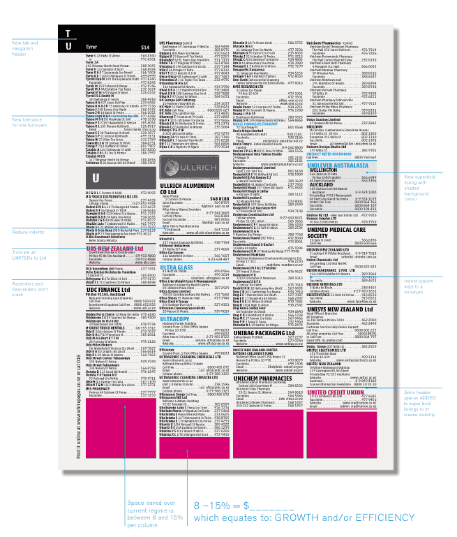
And, it was designed to make better use of the space. In fact, it was estimated that they would be able to save between 8% - 15% on every page (the pink area in this mock-up - click to see full size):

Imagine the total saving that could have been achieved in time by making this simple small change. You’ll have to, because they didn’t go for it.
Big is having a corporate commitment to environmental issues, perhaps even a long-term goal of being carbon neutral. Yadda, yadda.
Little is taking the opportunities to make real improvements when they are presented to you.
