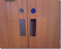
Affordance is a simple but powerful idea.
I first came across is in Don Norman’s book The Design of Everyday Things, but according to Wikipedia it’s much older than that.
At Webstock this year Liz Danzico defined it as: “providing uninscribed and detectable cues that loosely govern a set of actions or interactions”.
I would say: “make it obvious to me what I can or should do with things”.
The classic textbook example :
When you approach a swinging door how do you know which was the door opens? Do you push the door away from you? Or pull it toward you?
The “handle” that’s placed on the door should make this obvious.
Correct:

Picture: https://blogs.technet.com/ewan/
Incorrect:

Picture: https://www.iqcontent.com/blog
If you think about it the flat piece of metal with the word “push” commonly placed on doors is an odd design element. It has no real purpose other than to remove the doubt about the direction of the door, and perhaps to indicate where is an appropriate place for your hand to push. But, we’d struggle without them.
Some other examples from web design:
- Links should look like links (i.e. normally blue and underlined)
- Buttons should look like buttons (i.e. rectangular with a label, and probably with a subtle 3D effect to give the impression that you can press them in)
- Scroll bars should look like scroll bars (i.e. to the far right of the page and, ideally, using standard controls from your operating system)
- Tabs should looks like tabs (i.e. with the selected tab appearing to sit physically in front of the other tabs)
Notice a pattern here?
What other affordances make your life easier every day without you even noticing?
